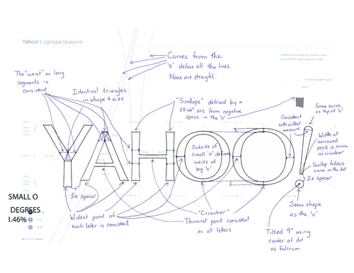
Yahoo unveiled the company’s new logo on Wednesday, the first design refresh in the 18 years. In a Tumblr post, CEO Marissa Mayer talks about the logo and the design.
Excerpts:
- On a personal level, I love brands, logos, color, design, and, most of all, Adobe Illustrator. I think it’s one of the most incredible software packages ever made. I’m not a pro, but I know enough to be dangerous :)
- We knew we wanted a logo that reflected Yahoo – whimsical, yet sophisticated. Modern and fresh, with a nod to our history. Having a human touch, personal. Proud.
- We didn’t want to have any straight lines in the logo. Straight lines don’t exist in the human form and are extremely rare in nature, so the human touch in the logo is that all the lines and forms all have at least a slight curve.
- We preferred letters that had thicker and thinner strokes – conveying the subjective and editorial nature of some of what we do.
- Serifs were a big part of our old logo. It felt wrong to give them up altogether so we went for a sans serif font with “scallops” on the ends of the letters.
- Our existing logo felt like the iconic Yahoo yodel. We wanted to preserve that and do something playful with the OO’s.
- We wanted there to be a mathematical consistency to the logo, really pulling it together into one coherent mark.
- We toyed with lowercase and sentence case letters. But, in the end, we felt the logo was most readable when it was all uppercase, especially on small screens.
-
Our last move was to tilt the exclamation point by 9 degrees, just to add a bit of whimsy.
- Our purple is Pantone Violet C – a pantone that needs no number and no introduction ;).
Here is a video created by the Yahoo team that talks about the design process:
[Image/video courtesy: Yahoo]


